Service
Brand Design
Client
Mandrake Bio
Year
2026

Concepts
The first concept was fully focused on gene editing. I created a bunch of logo iterations that show how the editing takes place and I wanted to emphasize on the cut. The second was more focused on protein structure but in an abstract manner.
1st concept - A DNA double strand mid-edit — the rungs between the two rails are the base pairs, and the interrupted/broken sections are reading as the cut site. 2nd Concept - The mark is constructed from a modular grid of circles — each unit representing a nucleotide base, the fundamental building block of genetic sequence.


Solution
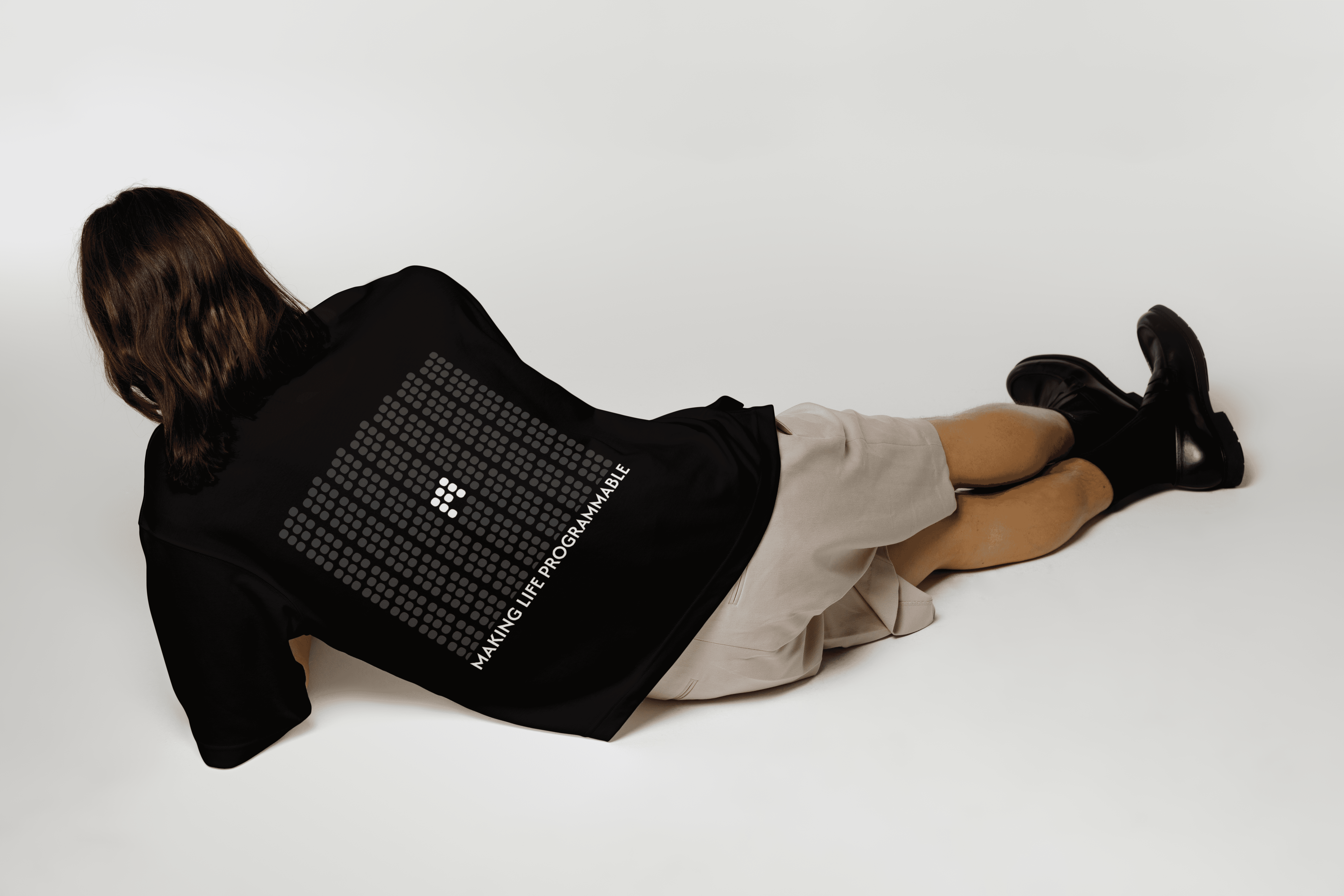
After that, the pixel concept was something that was finalized. However, they wanted it to look less complex and something with more meaning. The idea was to stick with the pixel circles but shape it in the form of a "M".
The overall mark reads as a sequence being read — moving from top-left to bottom-right like a polymerase moving along a strand, transcribing as it goes. There's directionality in the form even without an arrow.